Case study · 2026
How I built a diet soda archive with Codex
A solo weekend project about diet soda, visual systems, AI-assisted development, and seeing how far a very specific obsession could go.
- Timeline
- One weekend
- Compute time
- 9 to 12 hours
- Team
- Me + Codex
01 · My role
One person, three hats
Solo developer
This was my first time using OpenAI Codex. I made the product decisions, set the constraints, directed the build, tested the output, and shipped it. Yeah, that counts as development.
Field researcher
I went to convenience stores, stared into fridges, bought cans, drank them, and took the assignment far too seriously.
Designer
I shaped the brand, typography, color, components, spacing, page architecture, and the overall experience of browsing the archive.
02 · Purpose
The brief was not that deep
“I just wanted to make something cool, have an excuse to drink diet sodas, and larp as one of those AI entrepreneur tech bros.”
03 · Design + development
From fridge doors to a live website
The process was messy in the fun way. I collected references, worked out the content model, chose the tools, and went straight from a design system into development.
Inspiration
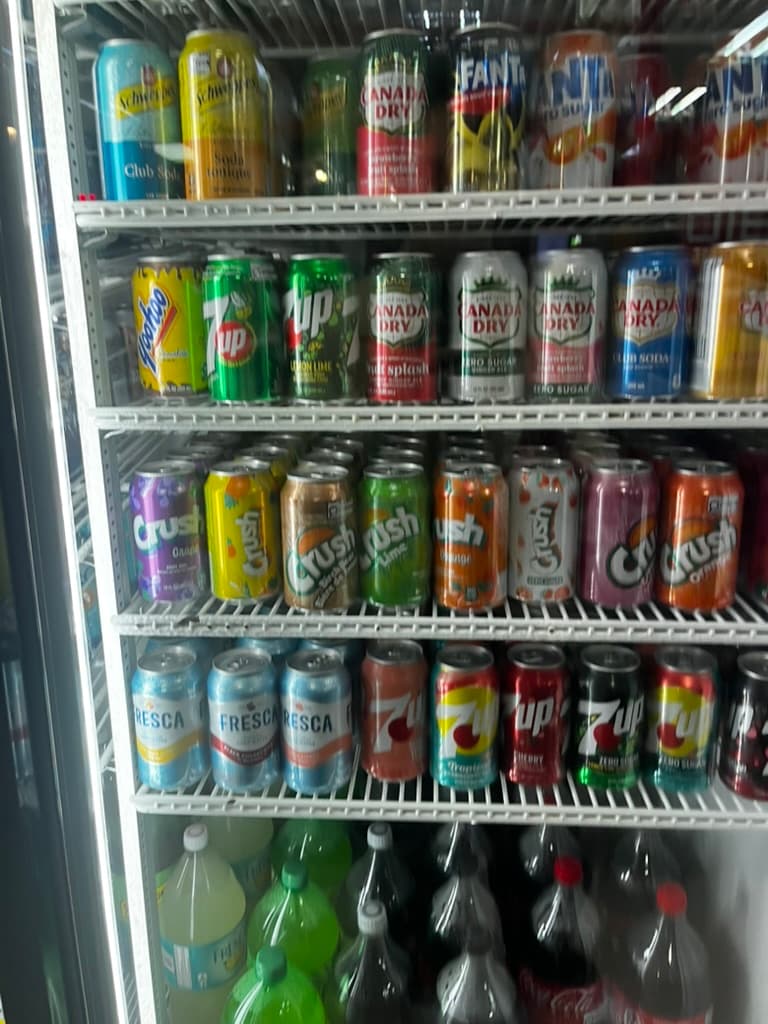
Fridges have great UX
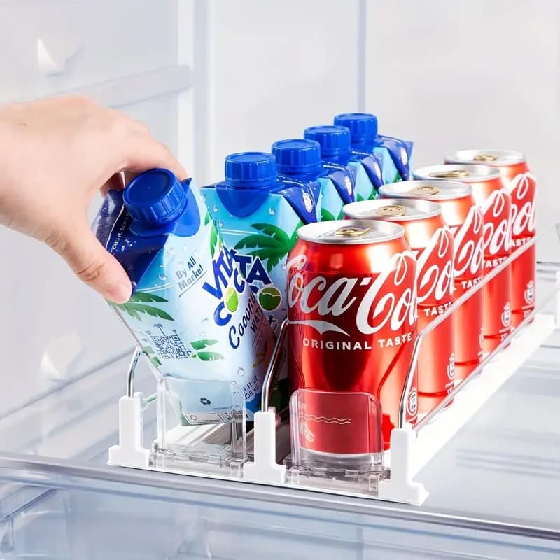
The first reference was the convenience-store fridge. Everything is visible through the glass. The labels do the visual work, the rows create order, and the ridiculous variety makes you want to keep looking. A fridge does not ask you to learn an interface. You scan, compare, and reach for what catches your eye. The shelves create predictable lanes while the glass gives you a low-friction preview of everything inside. That became the mental model for the home page.
Reference 04
Toppbrocales by Brewist ↗
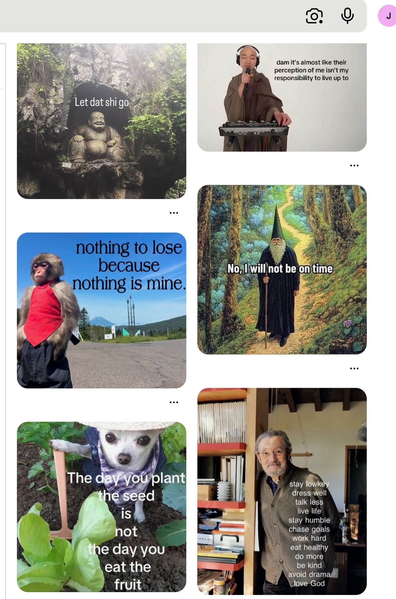
I knew I wanted some sort of tiled, grid UI. Something interactive, but I could not figure out what. Then this popped up in my LinkedIn algorithm. His subject was coffee. Mine became soda. I thought it was dope.
The outcome
The infinite soda canvas ↗
The home page became an amalgamation of those references: a huge, almost infinite canvas of cans. More will be added.
Content model
Figure out what the thing needs
Before building pages, I needed one source of truth and a repeatable way to judge each drink. A Google Sheet became the CMS for product details, review copy, and scores.
I also hit up my boy Clarence Lam for early ideas, help shaping the review rubric, and some initial testing of AI builders.
- 01
A CMS
A Google Sheet holds the product data, reviews, and scores.
- 02
A review rubric
Eight dimensions made every soda review consistent.
- 03
A banger home page
The first impression had to earn the whole idea.
- 04
A collection
One browseable fridge powered by the same data source.
- 05
Brand pages
Because filtering the archive by brand just makes sense.
- 06
An about page
A place for the lore behind the project.
- 07
Legal pages
Privacy, terms, and cookies, because we have to.
- 08
A scoring guide
A clear explanation of how each review breaks down.
Build
How this shit was built
Try the builders, pick the one that sticks
I tested Lovable, Cursor, Webflow, Framer, and OpenAI Codex. I had already built websites with Webflow and Framer. They are fun, but I wanted a new experience. Lovable and Cursor were dope too, right up until I ran out of credits.
Then I found out Codex was part of my OpenAI subscription. Fuck yeah. Let's stick with that.
I skipped the lo-fi Figma wireframes and went straight to development. Fuck it, we ball. I created brand guidelines for color, typography, components, spacing, and architecture, then gave those constraints to Codex.
Brand system, broken out
The brand system that gave Codex a clear set of creative constraints. Tap any piece to expand it.
Build the image pipeline
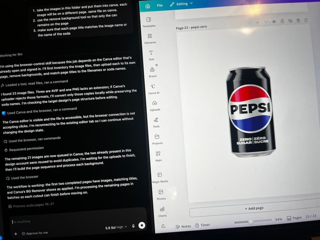
I needed photos of the cans. Ngl, I went to Google Images and did the classic right-click, save. Then I connected Canva and Codex so the repetitive background removal work could be automated.
Get it online
I was used to platforms where the builder and hosting were the same thing, so deployment was new territory. I asked my buddy Matthew Finlayson for advice. The answer was GitHub plus a host. I chose Cloudflare, installed the Codex plugins, and had Codex handle the unfamiliar parts without much hassle. Hell yeah. And yes, the repository is private.
Take it outside
The best part was how much of the project could happen hands-free. I connected ChatGPT on my phone to the Codex client on my MacBook, then gave voice instructions while I walked around, dilly-dallied, and meandered about. Total compute time landed around 9 to 12 hours. Solid weekend project, dude.
04 · Key takeaways
What I actually learned
Direction is the real unlock
AI moved fastest when it had a clear brand system, content model, and definition of what good looked like. The better the constraints, the less generic the result.
Hands-free does not mean thought-free
Codex could do the repetitive and unfamiliar work, but the taste, tradeoffs, quality checks, and weird little decisions still needed a person.
Small and weird is a great way to learn
A low-stakes obsession was enough to learn a full workflow: content, design, development, automation, deployment, and the judgment to connect them.
Questions? Opinions? Soda recs?
Let's talk about it
If you have questions about the project, want to talk AI-assisted design, or know a diet soda I need to try, send me a message on LinkedIn.
Message me on LinkedIn ↗